Bisson
Four sites, one brand.
CLIENT: Fratelli Bisson srl.
TECHNIQUE: flat, slides
YEAR: 2014
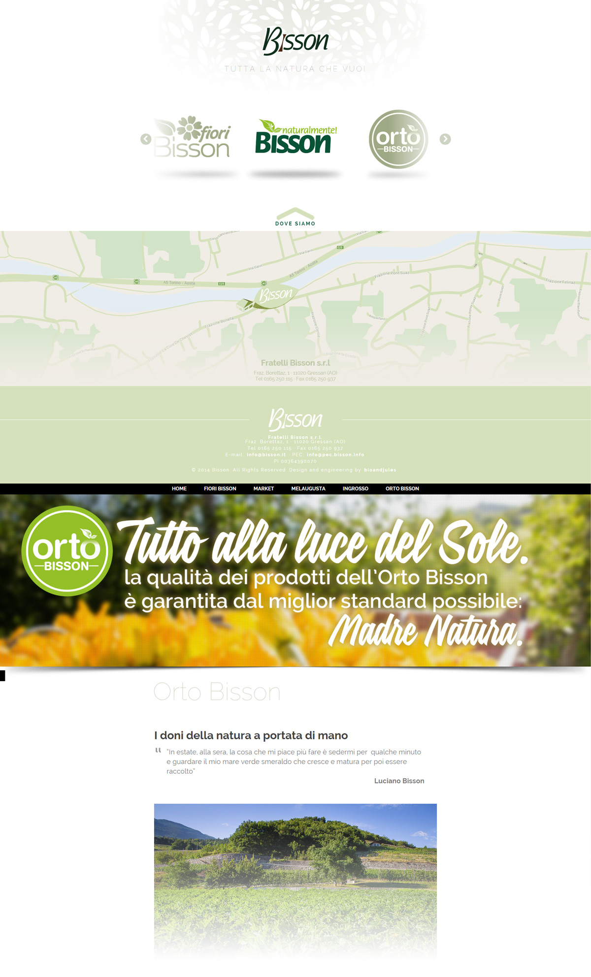
Bisson asked for a showcase site pointing out the different sections of their brand. In a word, they needed 4 showcase sites in one. We designed a clean and easy to navigate homepage and we made 4 content pages introduced by non-flash slideshows, in order to be viewed on IOS devices as well. For each of the 12 slides we made the concept, the copywriting, the graphics and the animations. It’s a lot of stuff, isn’t it?