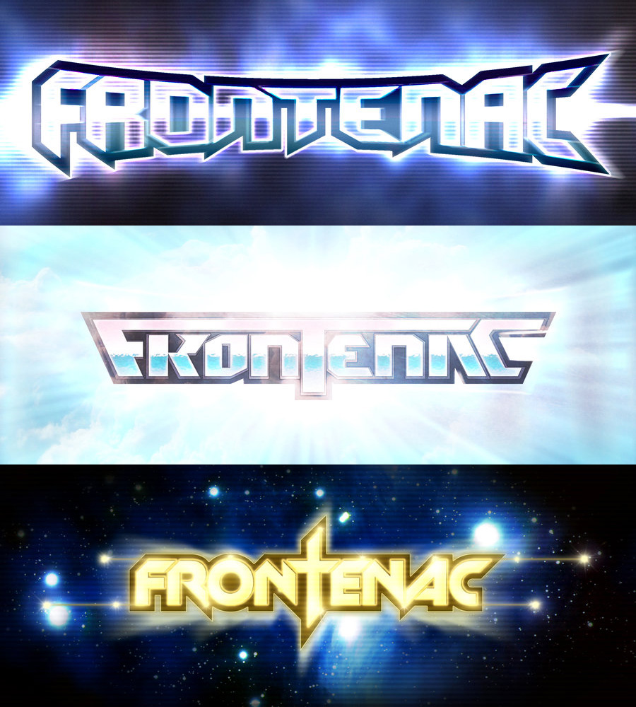
Frontenac
Logotypes
Lettering, lasers and booms
TYPE: Logo & Typo
CLIENT: Frontenac
TECHNIQUE: Vector + Raster finishing
YEAR: 2009
So, electronic band Frontenac was looking for a lettering to match with both their whatsoever canadian swag and with the already mentioned early 80s retro style. So we kept an eye for the symmetry of the name, divided by the central “T”, and we revisited all the glorious clichés of the era. They were so happy that could not choose one. They disbanded the very day.